
Guides
The photo that makes a renovation preview possible
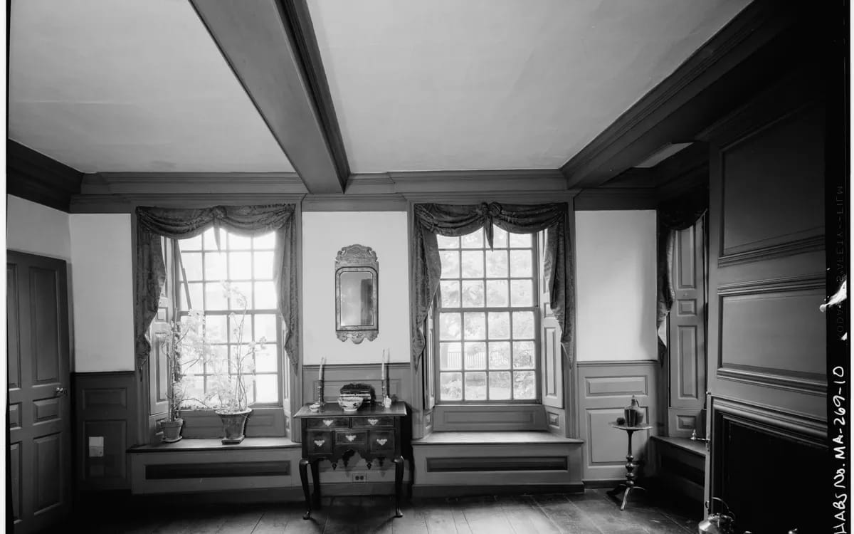
Two photos of the same room, taken on the same day: one will make it possible to show the space transformed, the other will not. The difference has nothing to do with the camera body or the number of pixels. It comes down to four decisions made on site, in a few seconds, that can never be made up for afterwards.
This guide describes those decisions. It is aimed as much at the owner who photographs their own property before having the images edited as at anyone who wants to know why they are being asked for a second visit. Nothing here is difficult; everything is lost when you do not know it.
Facing the wall, before anything else
A usable image is taken facing the wall you want to transform. The camera looks perpendicular to the surface: vertical lines stay vertical, horizontal lines stay horizontal, and the corner where floor meets wall forms a clean line. That is what later makes it possible to lay a new floor covering, a new colour or a new opening without the eye sensing the trick.
Photographed at an angle, the same room becomes a reconstruction exercise. Each surface recedes towards a different point, patterns distort, and the join shows. That is why architectural surveys have always worked wall by wall, face on: a discipline with no modern equivalent because it has never needed one.

The whole room, not the pretty corner
The natural reflex is to frame what is beautiful: the fireplace, the glass roof, the view. For a listing, that is a good idea. For image work, it is a trap. You need the complete volume, all four sides of the room if possible and at least three walls plus the floor-to-ceiling junction, because it is the volume, not the detail, that gives the scale.
A simple benchmark: step back until you can see the skirting board from one side of the frame to the other. If the skirting board leaves the frame on both sides, nobody knows where the room ends, and a mock-up laid on top of it floats.
Flat light is a quality
This is the most counter-intuitive point. In mood photography, you look for low-angled light, contrast, a nice cast shadow. For a working image you want the opposite: even light, with no blown-out area and no black corner. A patch of sunlight on a wall makes it impossible to change the colour of that wall, quite simply because nobody knows what the new shade would look like under that patch.
In practice, that means an overcast sky, or a time of day when the sun is not hitting the windows directly. It also means lights on, or lights off, but not both: mixing a yellow lamp and a blue window produces two whites in the same image, and any colour correction becomes shaky. White balance comes up again as soon as you work in low light, as our guide to filming in low light points out.
Ultra-wide angle: what it gives, what it costs
Small rooms tempt you to widen the angle, and widening it too far comes at a price. Beyond a certain point, objects near the edges stretch, furniture at the sides looks enormous, depth doubles and the room lies about its size. A buyer who discovers the gap on a viewing does not think “the photo was generous”: they think they have been misled, and they distrust the rest of the listing.
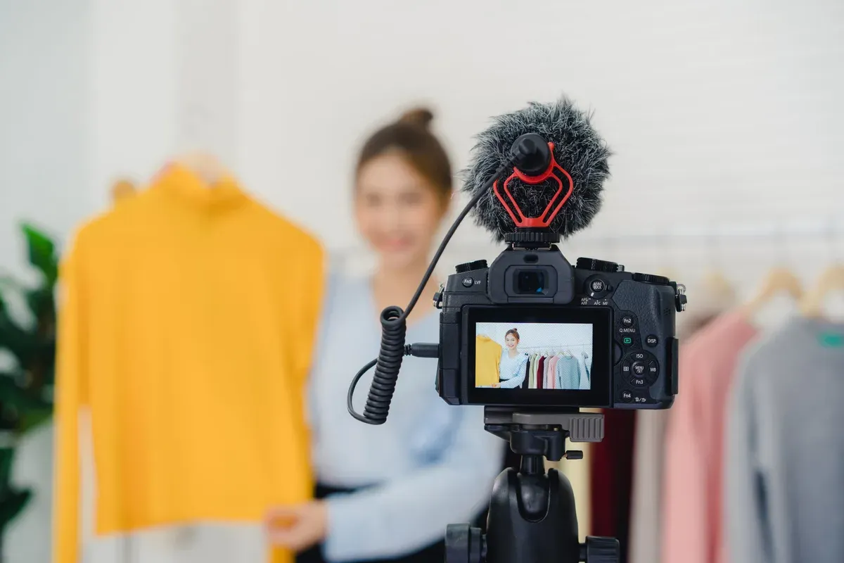
The sensible compromise fits in one sentence: go just wide enough to see the whole room from a corner, and no wider. The widest lenses, those of action cameras and 360 cameras, whose bulging glass is recognisable at first glance, remain very useful for walking through a space, much less so for producing a reference image from it. Each has its use; theirs are described in our guide to these lenses.
What makes a photo unusable
The list is short, and each item can be fixed in thirty seconds on site:
- An obstacle in the foreground. A door leaf, a curtain, a blurred corner of wall eating half the frame: whatever is hidden is lost, and nothing can rebuild it.
- A room shot diagonally. See above. It is the most frequent and most costly flaw.
- Clutter touching the surfaces to be changed. A piece of furniture against the wall you want to repaint forces someone to invent what is behind it.
- Two light sources of different colours. White no longer exists, and colour editing becomes approximate.
- An over-compressed image. A photo sent through a messaging app has lost the fineness of its materials: tiles, parquet or render are reduced to mush.
The method in five steps
| Step | Why |
|---|---|
| Stand facing the wall concerned | Lines stay straight, joins become invisible |
| Step back until the whole skirting board is visible | The volume gives the scale |
| Pick a moment without direct sunlight | No blown-out area, no shadow to work around |
| Decide: all lights on or all off | Only one white in the image |
| Set the camera down, do not hold it | The same viewpoint remains available for a second shot |
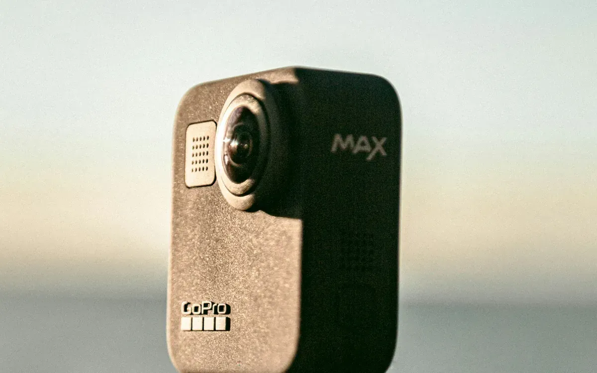
That last step is the one most often forgotten, and yet it opens the most doors. A camera set down means a frame you can repeat identically a month later, once the work has started, and at that point you are no longer producing a mock-up, you are showing reality. The same composition principles apply whatever the viewpoint, including from the sky, as our article on aerial composition points out.
If you would rather not deal with it yourself, this is exactly what an on-site shoot settles in an hour: we shoot the listing images first, then the reference images, without changing place or day. Describe the property and what you want to show, and I will tell you what your current photos already allow and what would need to be reshot.
More in this section
 Guides
Which device for which plan: the 2026 table
Five devices facing around ten current plans, with what each does better than the others and the pitfall of each. Choose the plan first, the device second.
4 min read Guides
Should you still buy a GoPro in 2026?
GoPro filed a financial document on June 1, 2026 mentioning “substantial doubt” about its continuity of operation. What this word means, and what it doesn't mean.
4 min read Guides
Why there is no American test for Mini 5 Pro
You are looking for a real test of the Mini 5 Pro or the Osmo Pocket 4P and you only find unboxings. This is not your request: these devices are not sold in the United States.
3 min read